
POSITIVE POTATO
When PMS acquired the license for Positive Potato, the challenge was clear: create a recognisable brand that stood up to the flood of knock-offs being produced worldwide. My role was to take this viral handmade toy and transform it into a recognisable, retail-ready brand, one that buyers could trust and consumers would connect with. From day one, I drove the design vision, creating a holistic brand system that celebrated the product’s humble origins while elevating it for mass retail.
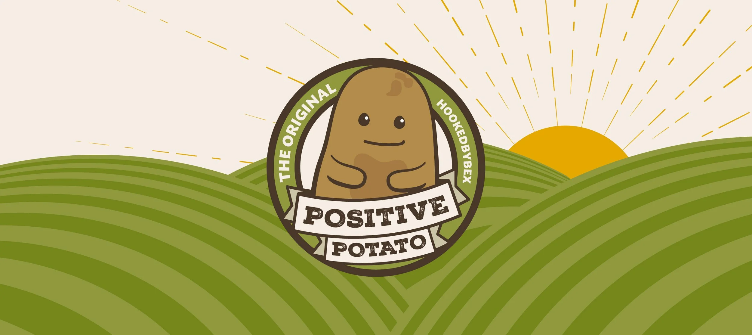
BRAND CONCEPT
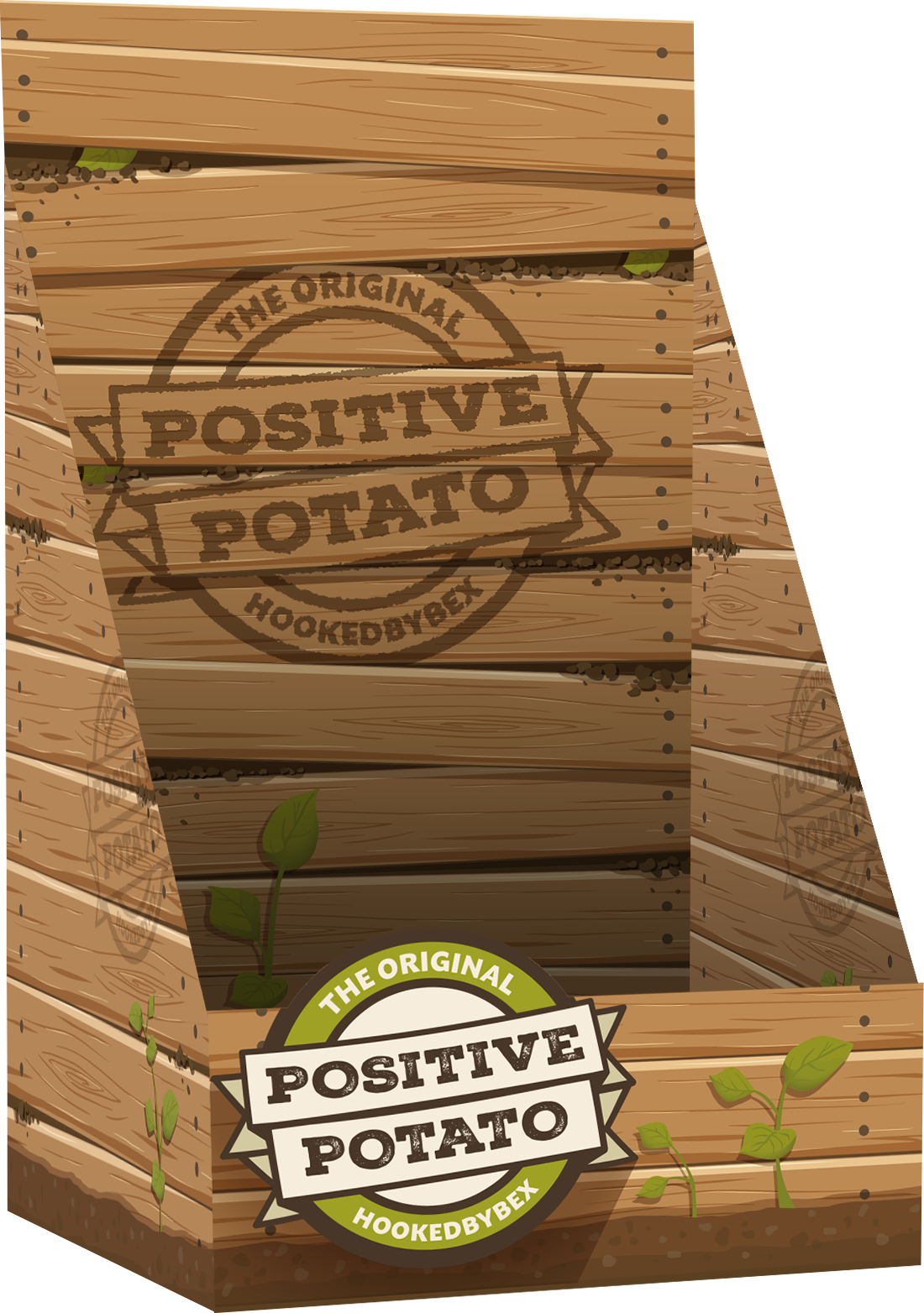
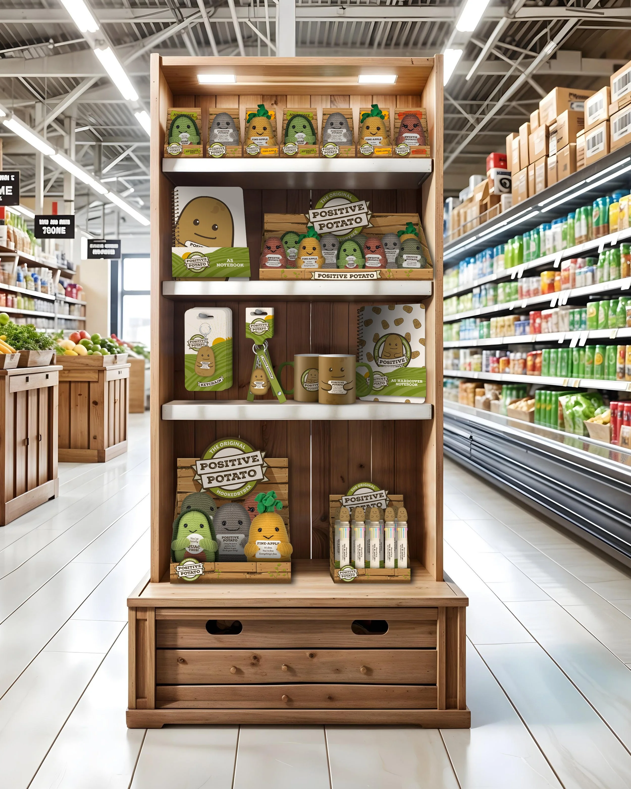
We worked closely with creator, Bex, to ensure we stayed true to the brand’s essence. To honour that authenticity, I grounded the brand in rustic, handmade visuals. I researched market stalls, farm crates, and wholesale vegetable packaging, drawing inspiration from how produce is displayed and traded. This led to the core concept: a crate-style design, with a rustic logo and characterful typography that felt as if it had grown straight from a market stall.

CHARACTER ILLUSTRATIONS
The first step was to recreate the 6 core characters in Bex’s crochet line-up as vector illustrations. I started with Steve (the Positive Potato) as I wanted to show logo options which featured him, and from there a style and character set was created.
PACKAGING
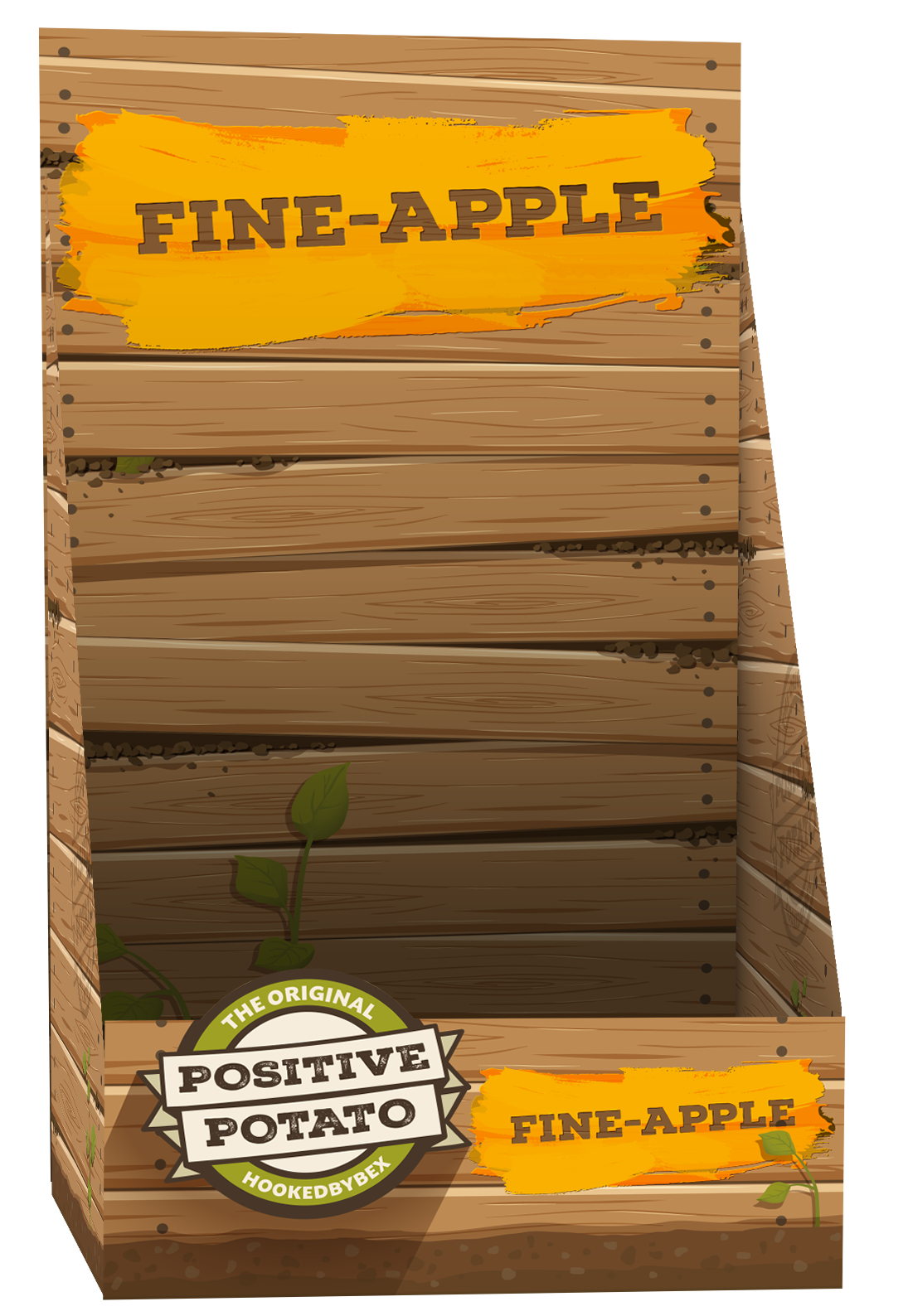
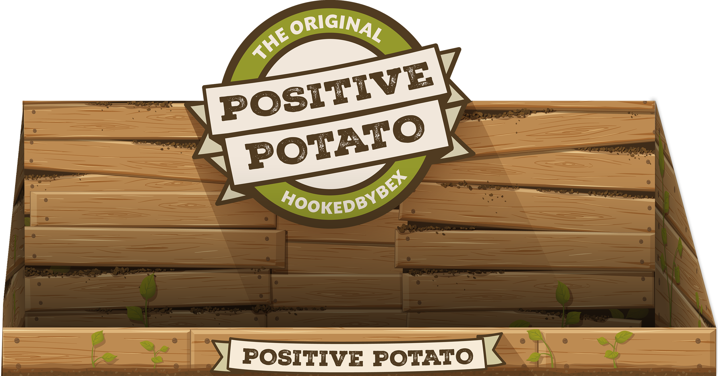
The crate packaging became the cornerstone of the brand, enhancing the organic, farm-to-shelf aesthetic that sets the product apart. For smaller prints, like swing tags, I created a rolling hills design, reminiscent of a farmer’s field, which could be adapted for use across print and marketing collateral. In my research, I was discovering a lot of produce suppliers used stamps and stickers to ‘brand’ their materials, so this became a central focus when designing the logo and experimenting ways with which to reinforce the brand.


PRODUCT DESIGN
Beyond the core plush, I expanded the range into new characters and lifestyle products. Working with Bex and the buyers at PMS, I developed the “Positive Potato Friends” line, a family of illustrated and plush characters that built on the original while keeping the heart of the brand intact. Alongside these, I created branded extensions like mugs, notebooks, pens, and tote bags. Each addition was designed to feel part of the same story, playful yet authentic, and always unmistakably Positive Potato.

MARKETING & RETAIL COLLATERAL
To sell the product on an international level, I created a full suite of POS mockups, exhibition visuals, and marketing collateral. These were showcased at the Brand Licensing Expo in London and the New York Gift Fair, where the brand received strong feedback and secured worldwide rollout plans. These visuals, including display stands which I stencilled myself, helped retailers visualise how Positive Potato could live on their shelves, from playful point-of-sale boards to in-store displays.

SPECIAL PROJECTS
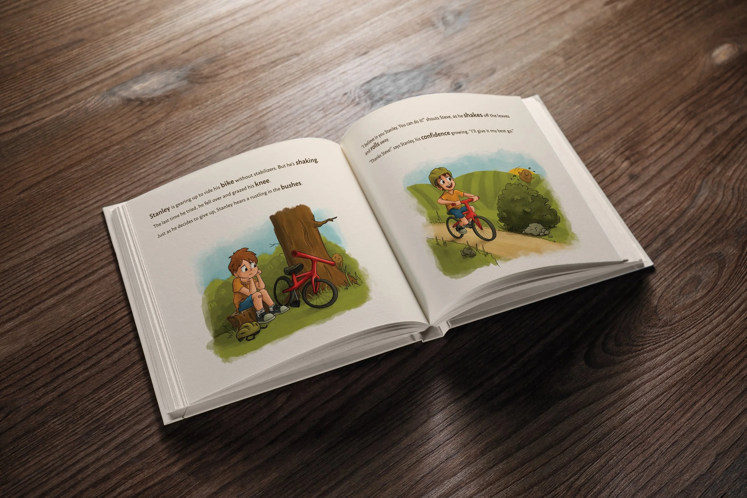
As the brand grew, we were asked to explore narrative formats, leading to the Positive Potato book. I illustrated the visuals, building on a story written by Bex, and extended the brand’s style into publishing. This project showed the flexibility of the system I’d created: it could move seamlessly from packaging to publishing, always retaining the same warmth and identity.

REFLECTION
Positive Potato started as a single handmade toy, but through design it became a brand with global potential. I took ownership of every stage, from defining the visual language and packaging system to expanding the range and creating collateral that gave buyers confidence. What made the project so rewarding was finding the balance between heart and commercial viability: staying true to the product’s handmade roots while building a consistent identity that worked across packaging, licensing, publishing, and retail. It proved how creativity, consistency, and craft can transform something small into a universal brand system.