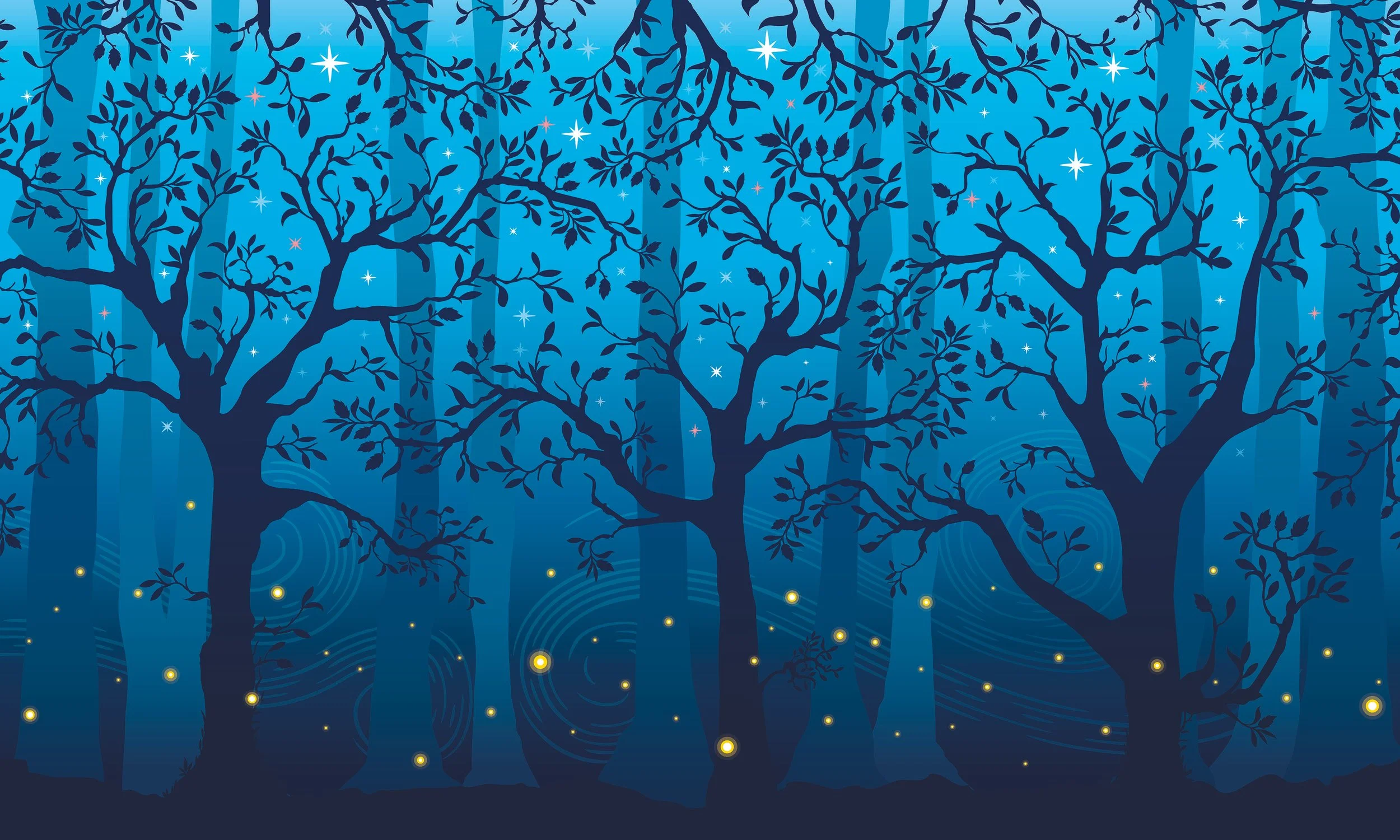
I first joined the Forbidden Forest Experience to create a set of designs for the trail’s opening facilities. What started as a small brief quickly grew into a multi-year collaboration. Each season brought new challenges: designing at scale, balancing practicality with magic, and producing artwork that could hold its own in a night-time forest environment. Over three years I delivered everything from large-format installations to intricate props and print, owning the creative from concept through to production. My work became a consistent part of the evolving experience, helping it grow year on year.
HARRY POTTER: A FORBIDDEN FOREST EXPERIENCE
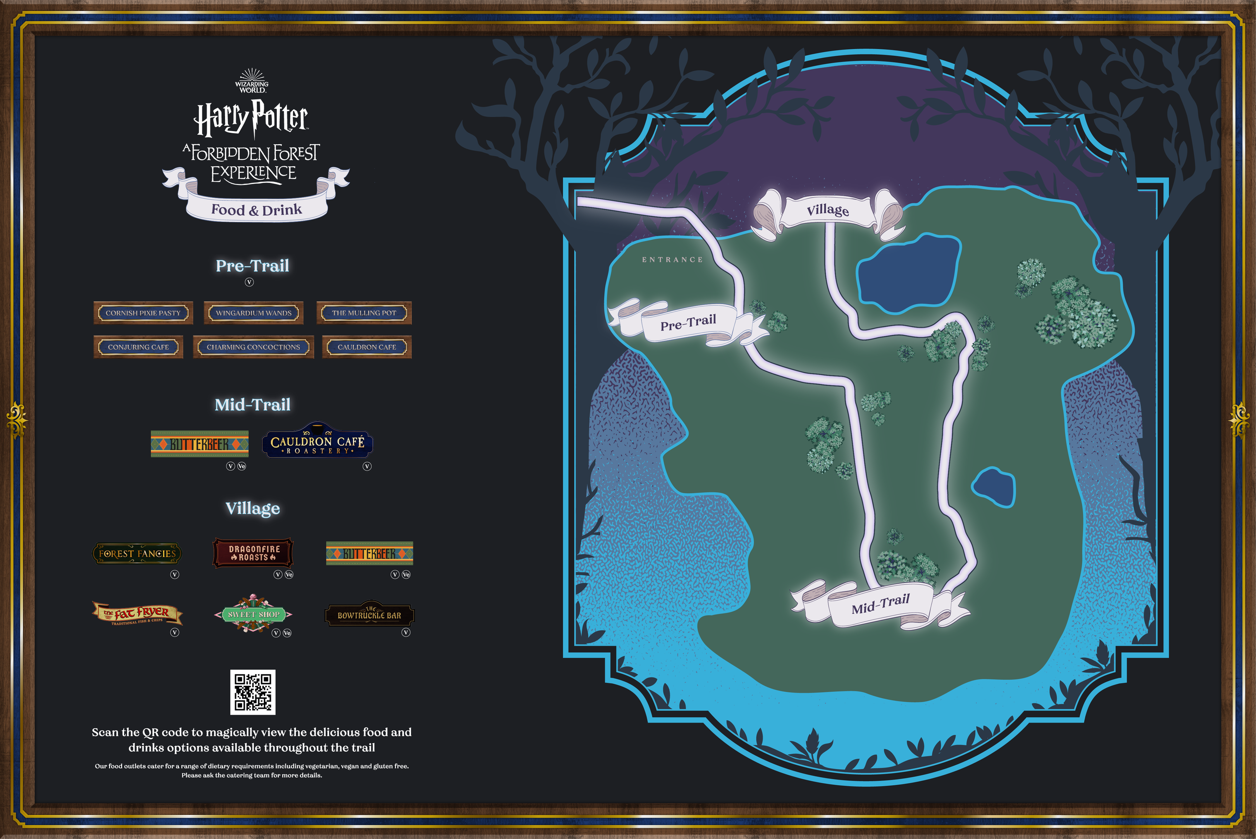
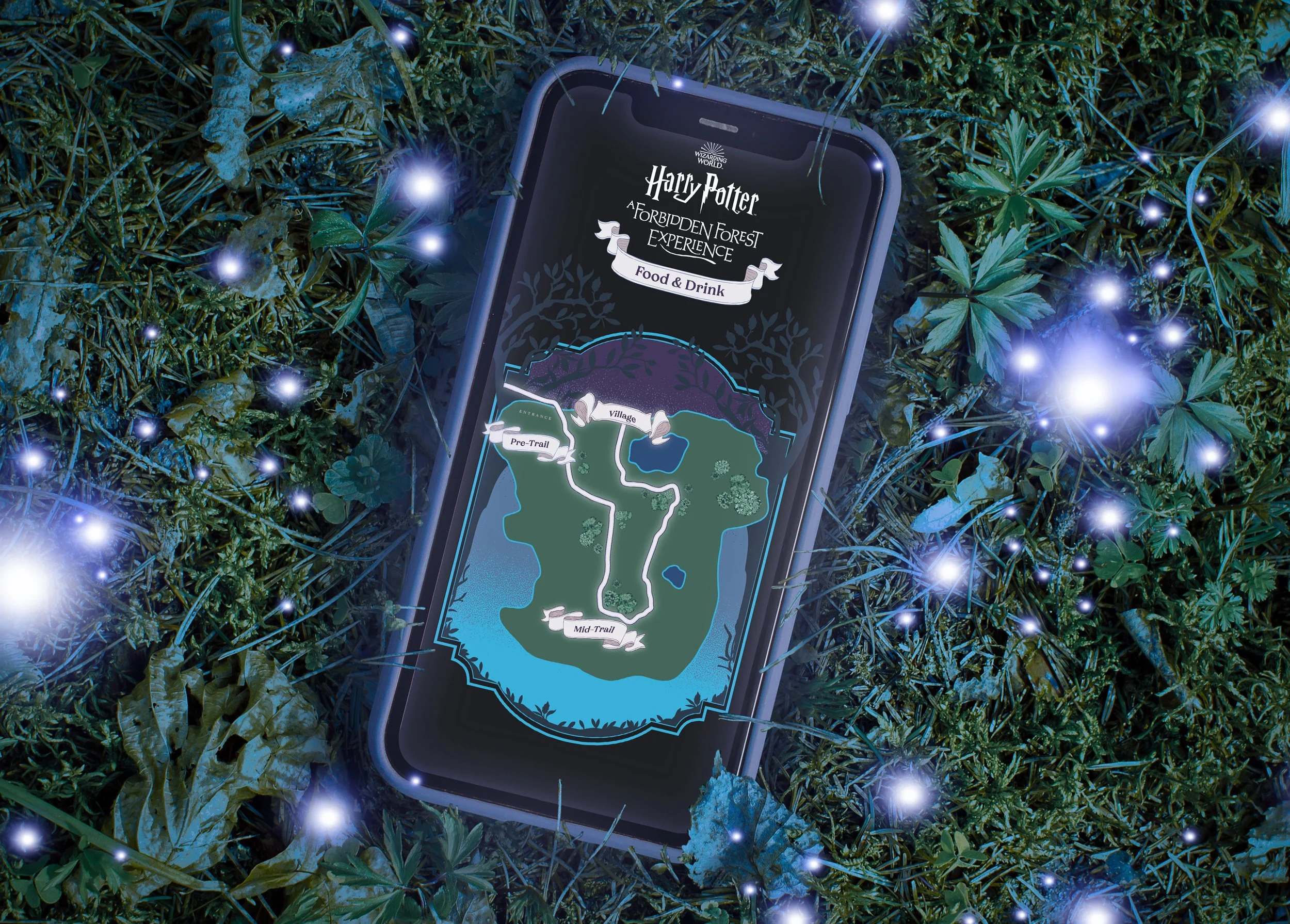
The trail map needed to work both as a large-format sign and an in-app guide. Hierarchy of information was key, balancing illustration, texture, and clarity to keep it legible in dim light, while still feeling magical and immersive as part of the worldbuilding.

Vinyl wrap designs needed to stand out in a dark, wooded setting with limited lighting. A bold silhouette style against a vibrant blue sky gave instant impact, while a continuous artwork allowed flexibility across multiple vans without breaking the visual flow.

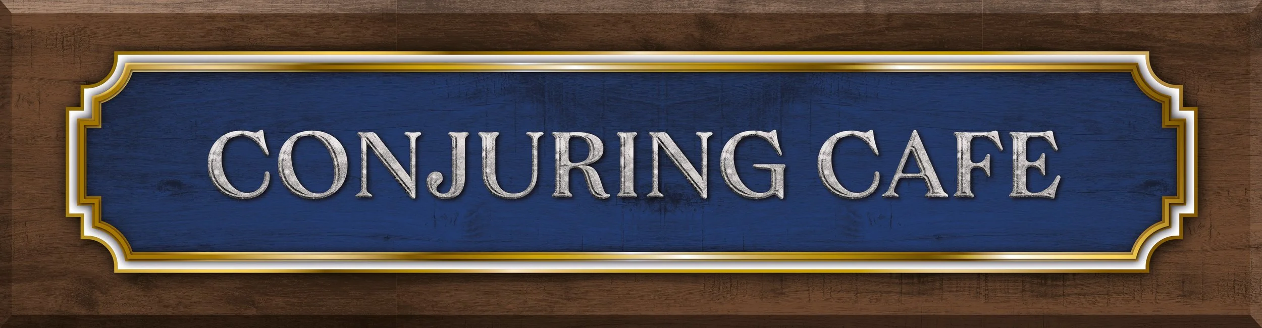
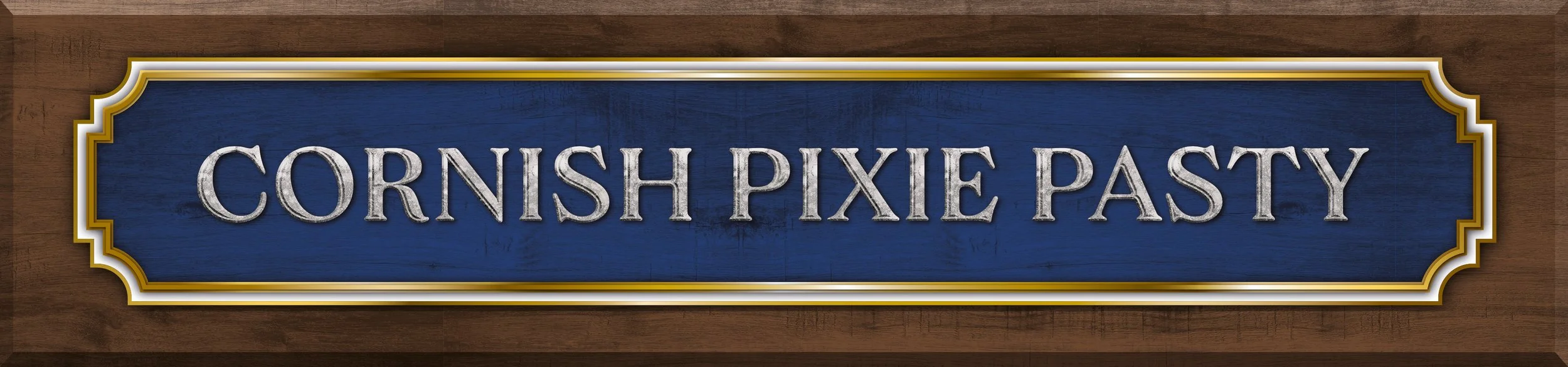
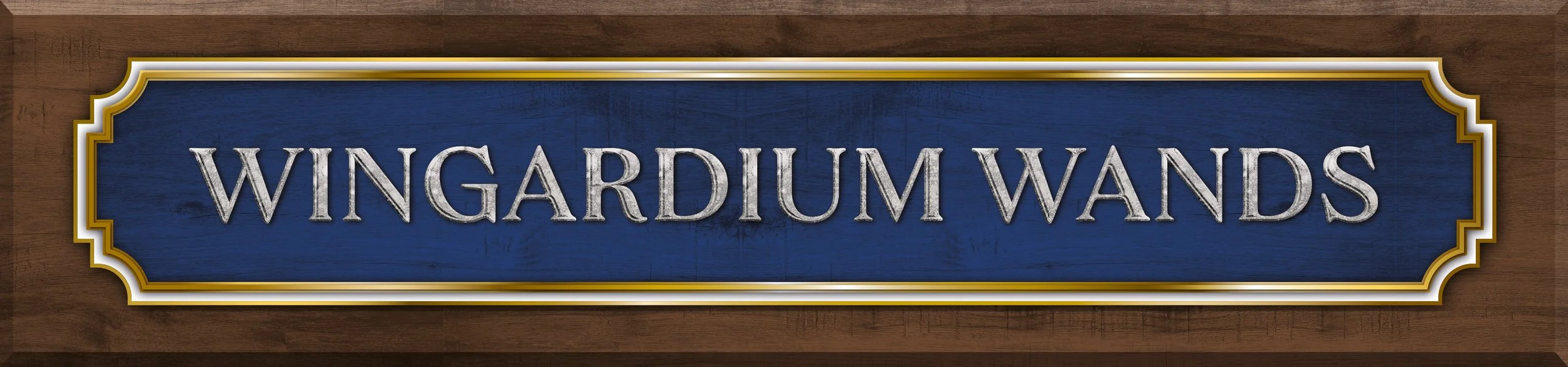
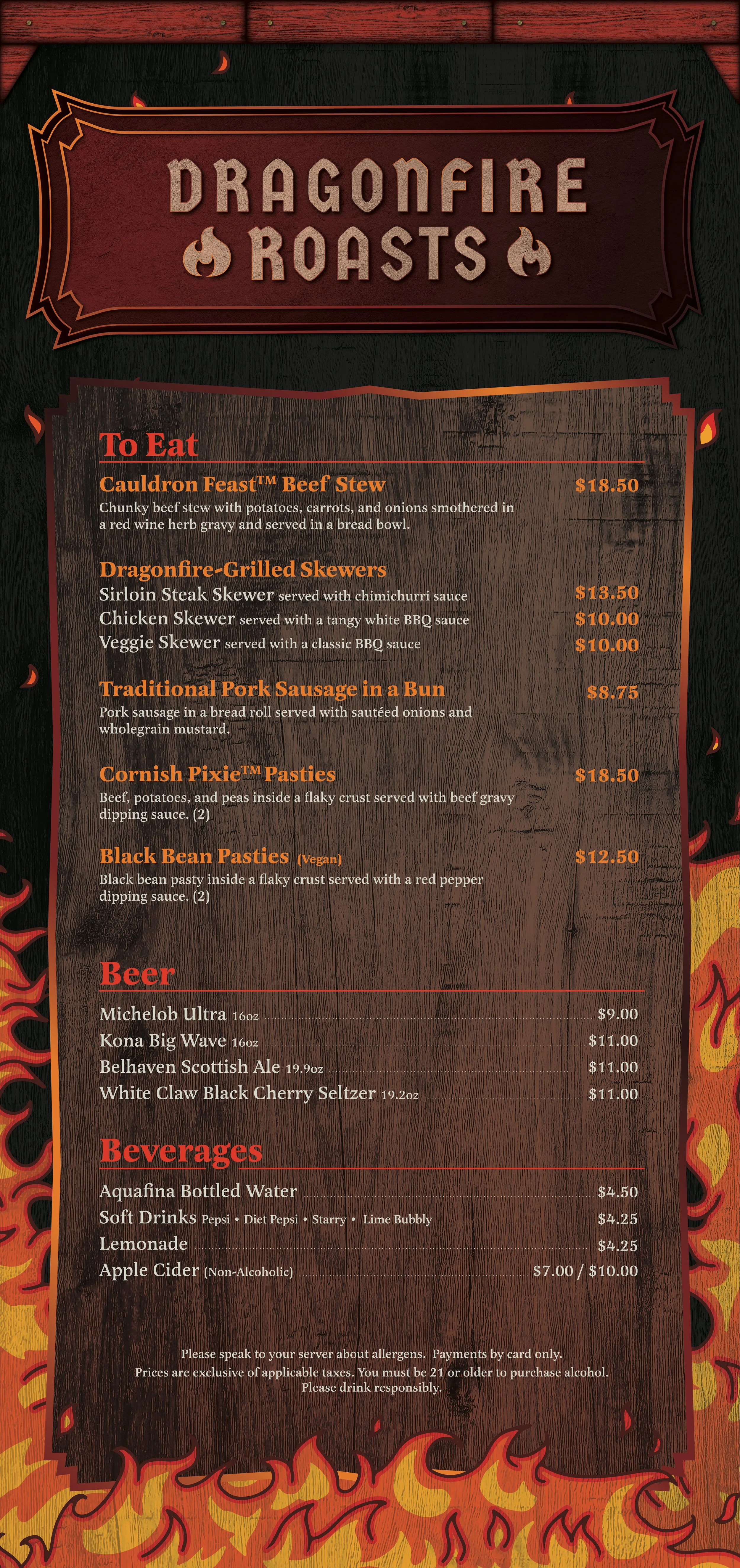
Bold signage carried the same visual language for consistency across cuisines.

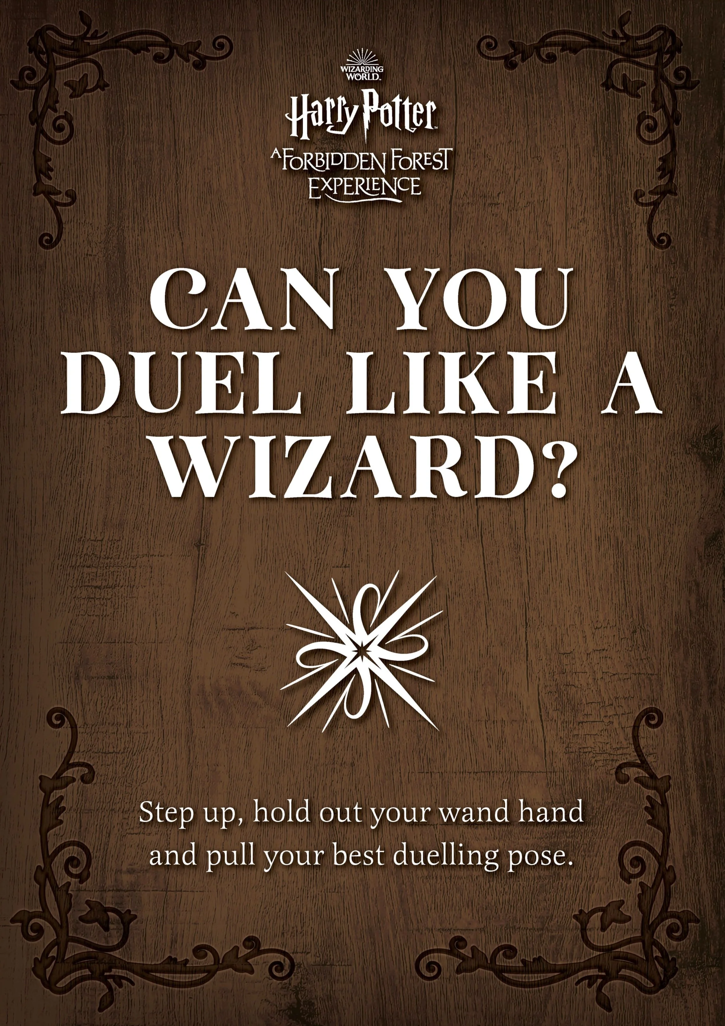

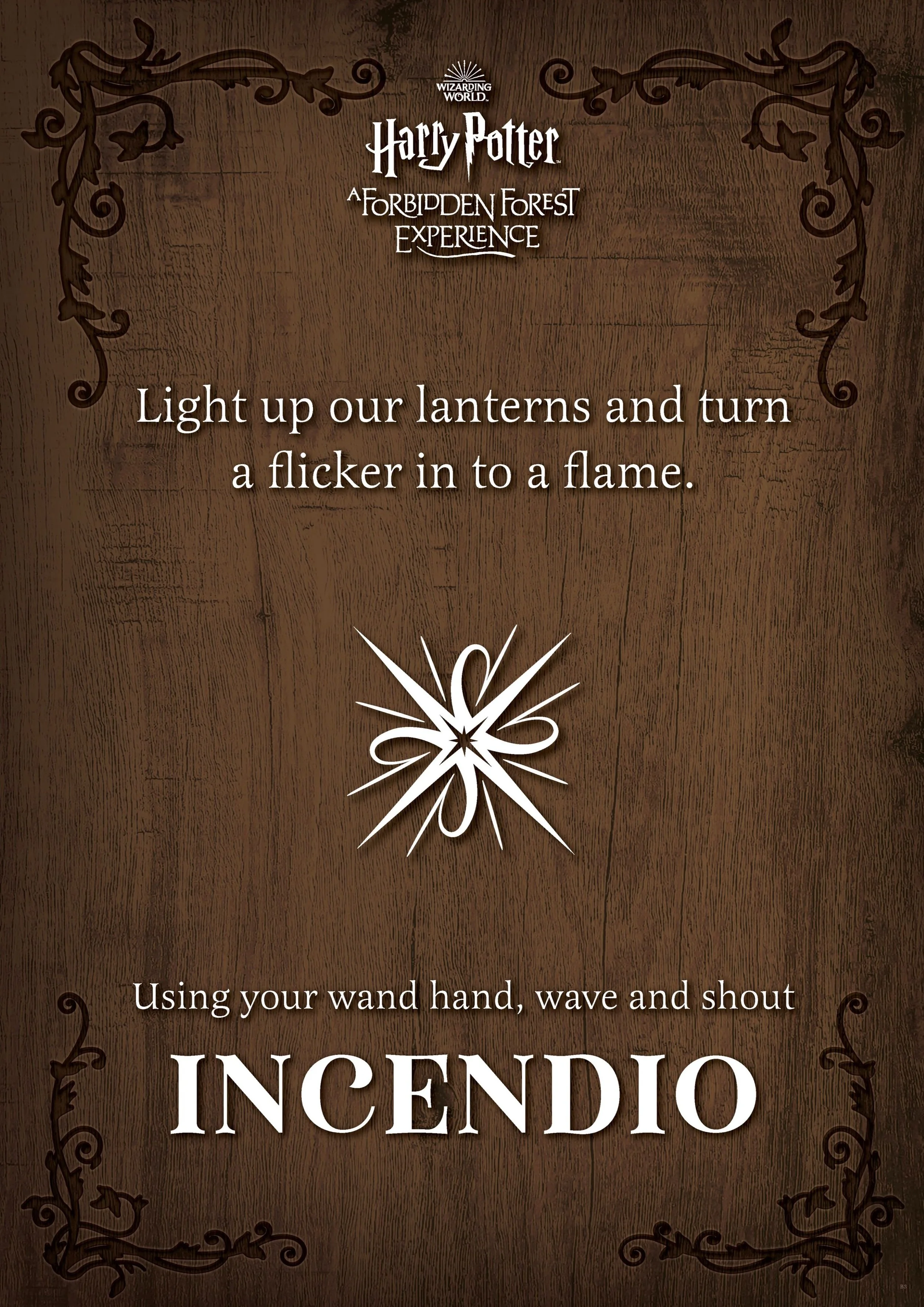
Signs needed to instruct guests without breaking immersion. Each panel used thematic graphics, typography, and tone to fit within the magical world, while still giving clear directions, such as guiding guests to perform the correct action to trigger interactive installations like colour-changing mushrooms.


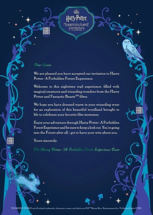
The brief was to design a letter that looked authentic without an envelope. A trifold format solved the problem, folding to show an address and wax seal before opening into the illustrated letter. Exclusive to VIP packs, it became a collectible for dedicated fans.
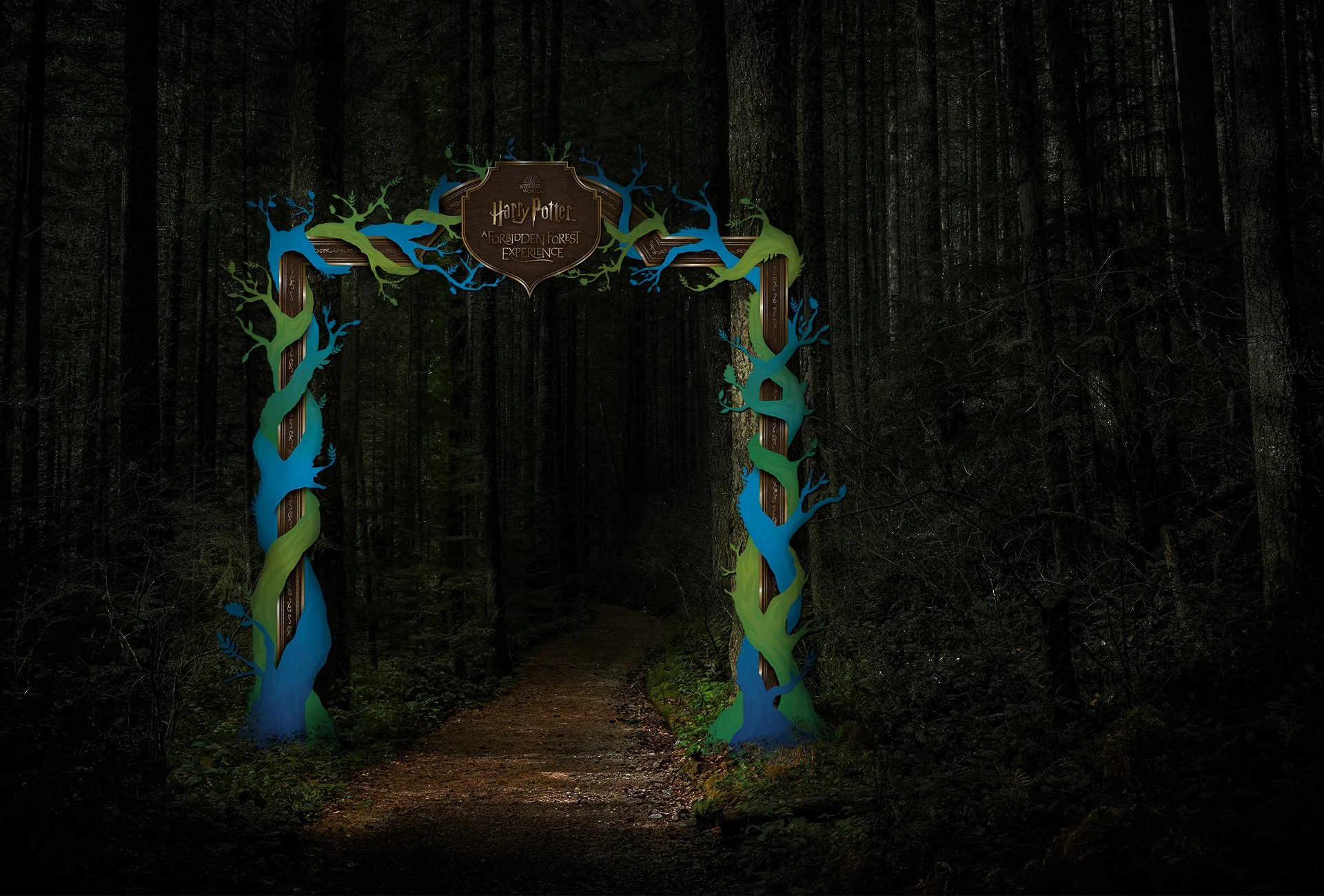

This installation had to function as both gateway and spectacle. The luminous vine artwork was created to glow against the black building, while scaling adjustments ensured branches framed the door without obstructing access, blending practicality with the magical aesthetic of the event.

Each stall had a distinct theme and cuisine, requiring designs that were both bespoke and cohesive. Butterbeer, in particular, needed careful handling to align with MinaLima’s brand style - approved first time by WB - while others balanced humour, theme, and legibility at large scale.


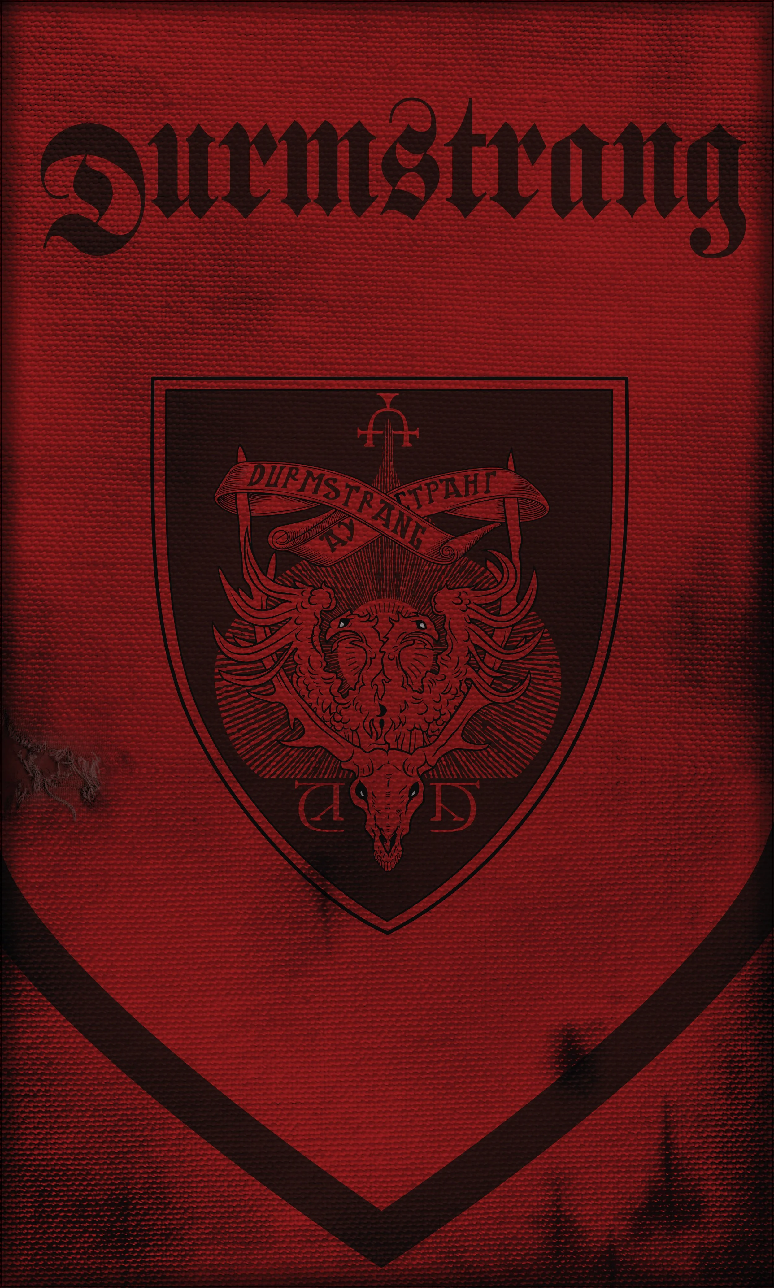
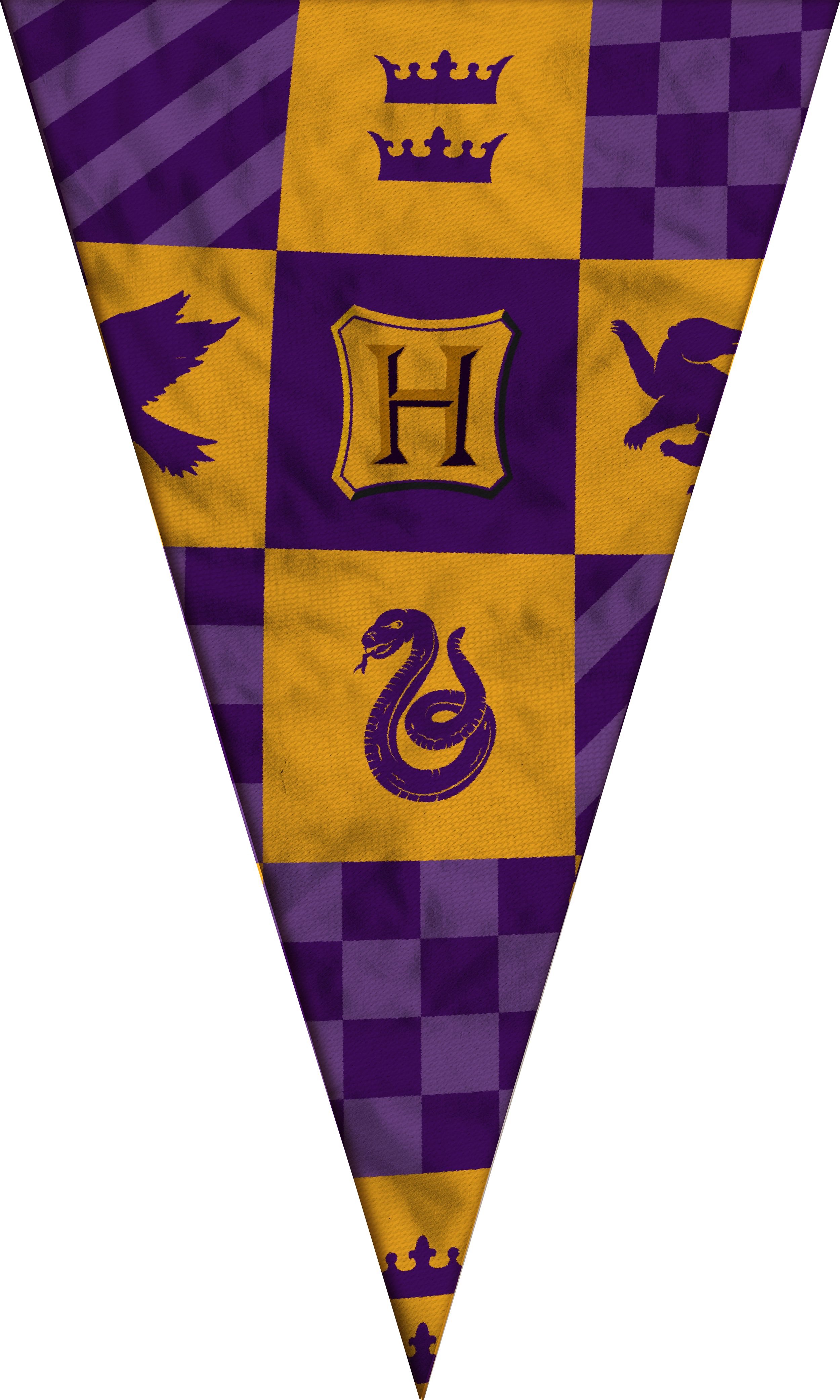
Time constraints meant printing rather than fabric construction on these flags, so the distressed “battle-worn” look was built digitally. Research into collegiate and heraldic flags informed layouts and textures, resulting in a striking run of banners that brought motion and depth along the trail.